R Crash Course Examples
Repository of Codes
以下是11/13日Talks我将带大家学习的可视化范例。由于时间的限制,我无法将所有函数讲完,但我会教会大家如何修改代码快速实现制图。这个页面会定期更新,需要的同学可以保存,在需要代码的时候直接复制修改使用。
Presets
#install.packages('tidyverse')
#install.packages('gapminder')
#install.packages('hrbrthemes')
#install.packages('viridis')


# 如果你想要重现动图,还需要安装以下Package
#install.packages('gganimate')
#install.packages('gifski')
调用需要的Package
library(hrbrthemes)
library(viridis)
library(tidyverse)
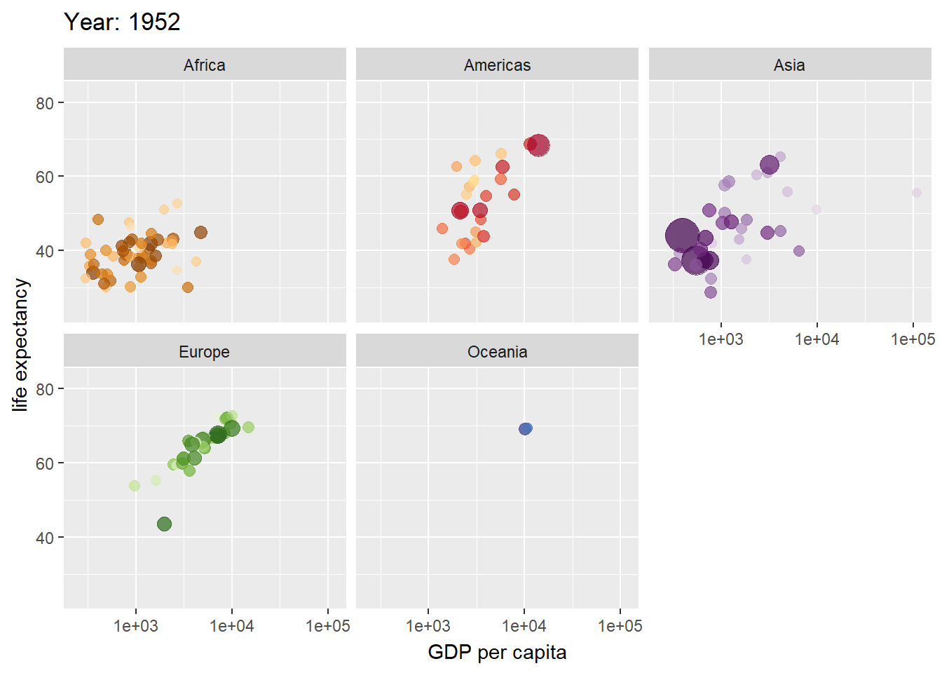
Intro Plot: GDP vs life expectancy at birth, in years
动态图
library(gganimate)
library(gapminder)
ggplot(gapminder, aes(gdpPercap, lifeExp, size = pop, colour = country)) +
  geom_point(alpha = 0.7, show.legend = FALSE) +
  scale_colour_manual(values = country_colors) +
  scale_size(range = c(2, 12)) +
  scale_x_log10() +
  facet_wrap(~continent) +
  # Here comes the gganimate specific bits
  labs(title = 'Year: {frame_time}', x = 'GDP per capita', y = 'life expectancy') +
  transition_time(year) +
  ease_aes('linear')
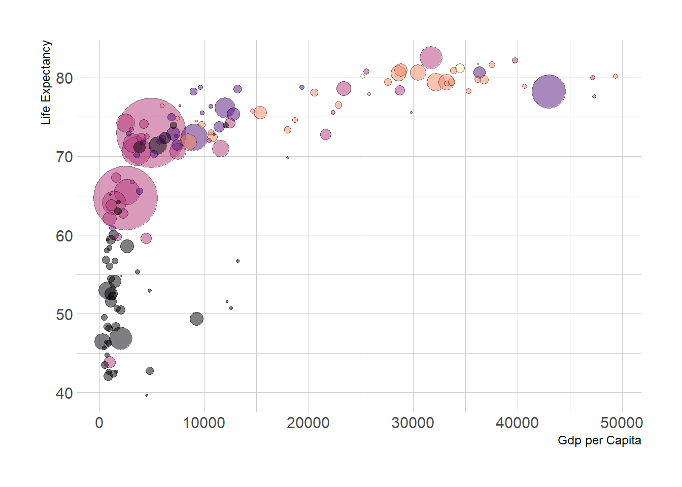
静态也可以很美
gapminder %>%
  filter(year==2007)%>%
  arrange(desc(pop)) %>%
  ggplot(aes(x=gdpPercap, y=lifeExp, size=pop, fill=continent)) +
    geom_point(alpha=0.5, shape=21, color="black") +
    scale_size(range = c(.1, 24), name="Population (M)") +
    scale_fill_viridis(discrete=TRUE, guide=FALSE, option="A") +
    theme_ipsum() +
    theme(legend.position="bottom") +
    ylab("Life Expectancy") +
    xlab("Gdp per Capita") +
    theme(legend.position = "none")
Basics: Pipe
Pipe 就是管道,用来流通数据。“%>%” 可以理解为将数据从左端输送到右端的函数里面。 当然你也可以不用管道,那就需要函数套函数,这样很不美观:)
举个栗子: a(b(c(d(gapminder))))
Data Wrangling
以下是几个作图中经常遇到的,简单的数据操作
- mutate() adds new variables that are functions of existing variables
- select() picks variables based on their names.
- filter() picks cases based on their values.
- summarise() reduces multiple values down to a single summary.
可以到这里学习更多的操作(dplyr)[https://dplyr.tidyverse.org/]
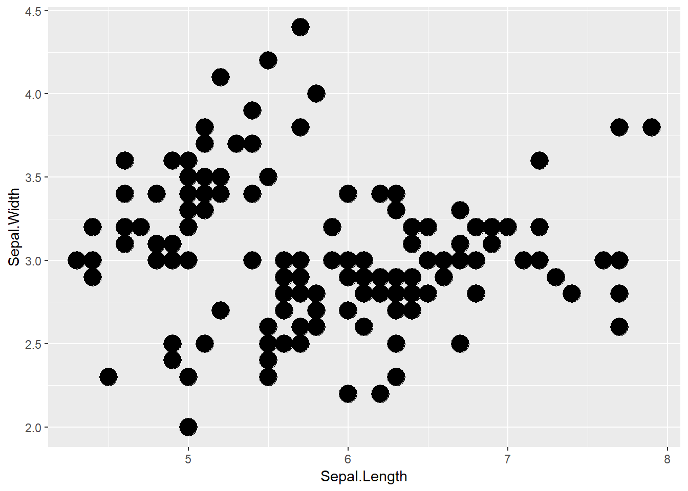
Scatterplot
ggplot(iris, aes(x=Sepal.Length, y=Sepal.Width)) +
    geom_point(size=6)
增加种类变量
ggplot(iris, aes(x=Sepal.Length, y=Sepal.Width,color=Species)) +
    geom_point(size=6)
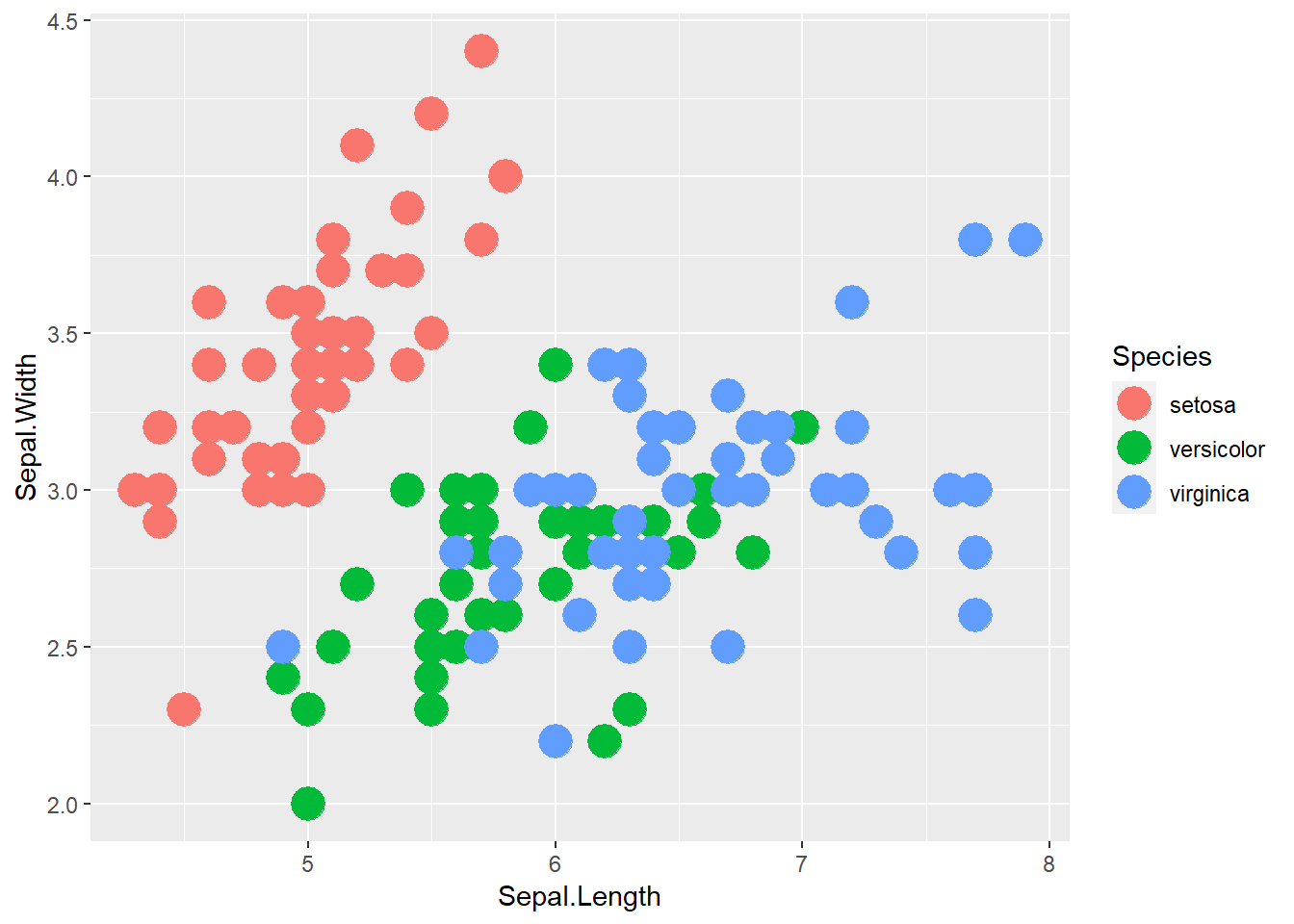
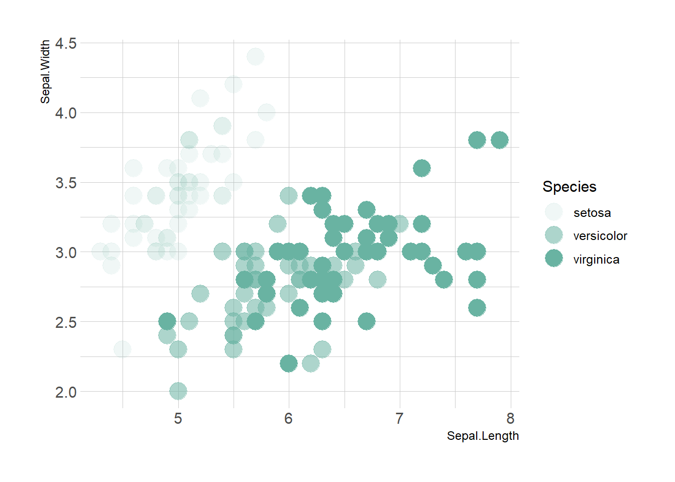
想对应什么,就对应什么
# Transparency
ggplot(iris, aes(x=Sepal.Length, y=Sepal.Width, alpha=Species)) +
    geom_point(size=6, color="#69b3a2") +
    theme_ipsum()
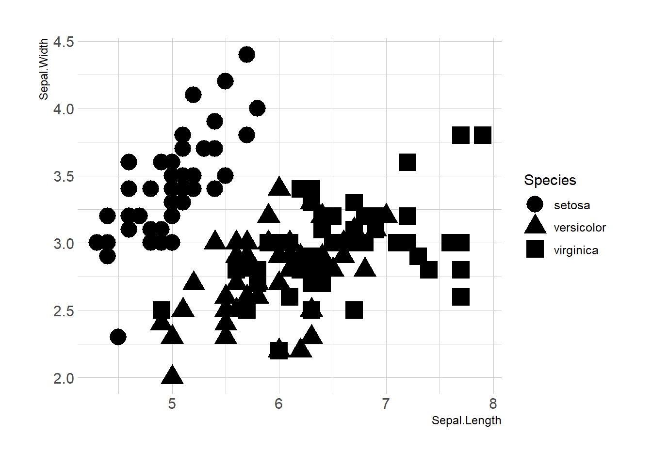
# Shape
ggplot(iris, aes(x=Sepal.Length, y=Sepal.Width, shape=Species)) +
    geom_point(size=6) +
    theme_ipsum()

# Size
ggplot(iris, aes(x=Sepal.Length, y=Sepal.Width, shape=Species)) +
    geom_point(size=6) +
    theme_ipsum()
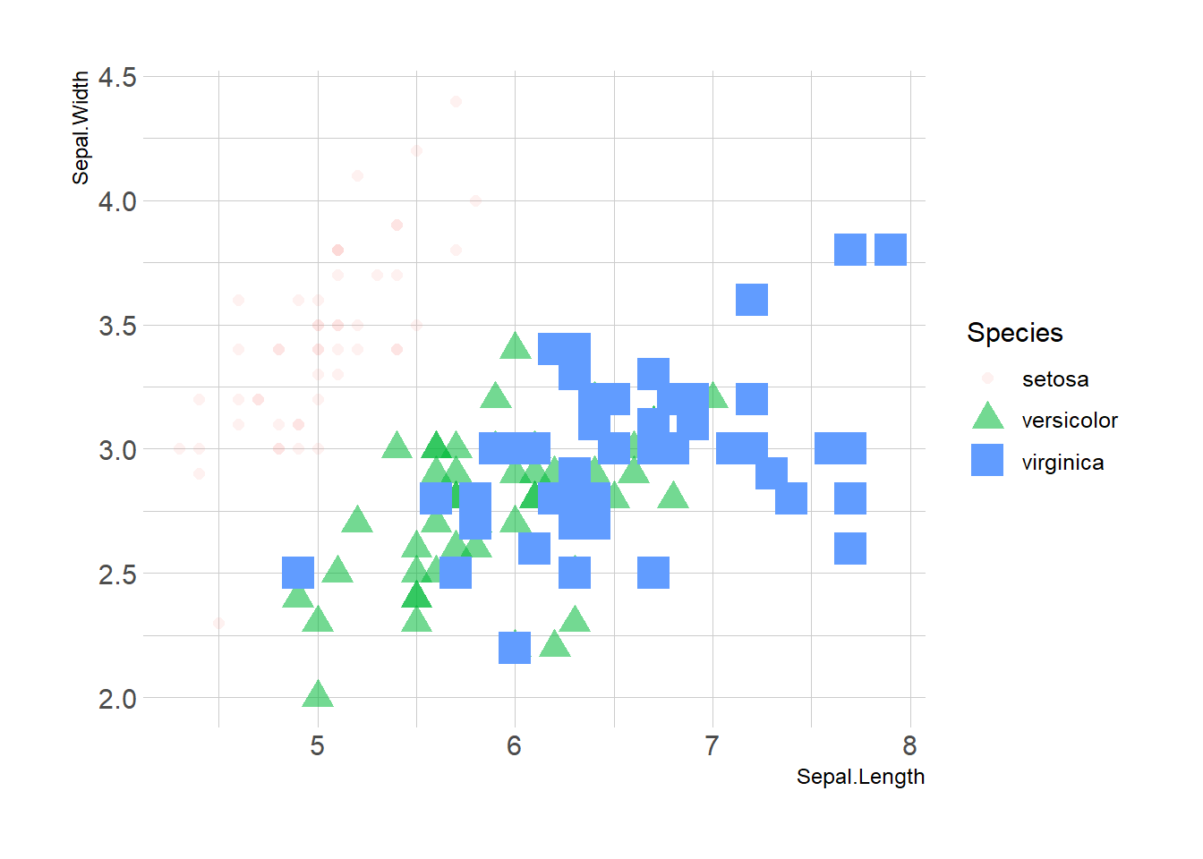
# 疯狂映射(请不要这样使用)
ggplot(iris, aes(x=Sepal.Length, y=Sepal.Width, shape=Species, alpha=Species, size=Species, color=Species)) +
    geom_point() +
    theme_ipsum()
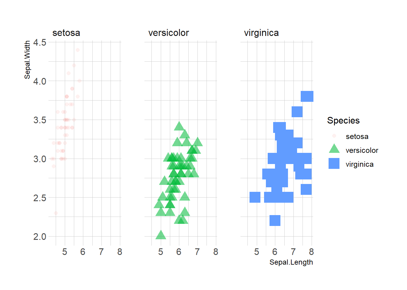
分个面
ggplot(iris, aes(x=Sepal.Length, y=Sepal.Width, shape=Species, alpha=Species, size=Species, color=Species)) +
  facet_wrap(~Species)+
    geom_point()+
    theme_ipsum()
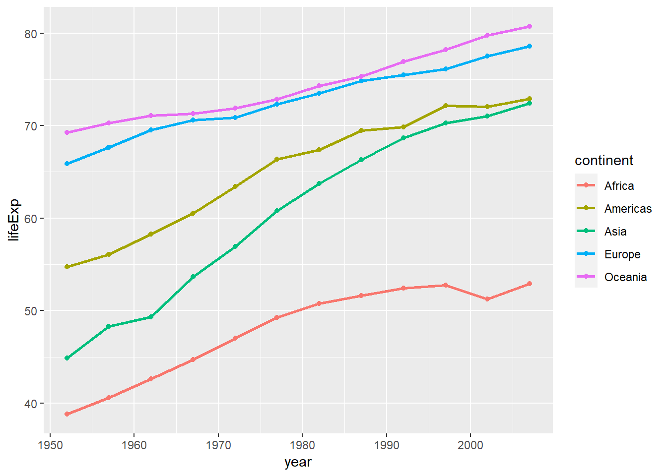
Line
gapminder %>%
    group_by(continent, year) %>%
    summarise(lifeExp=median(lifeExp)) %>%
    ggplot(aes(x=year, y=lifeExp, color=continent)) +
     geom_line(size=1) +
     geom_point(size=1.5)
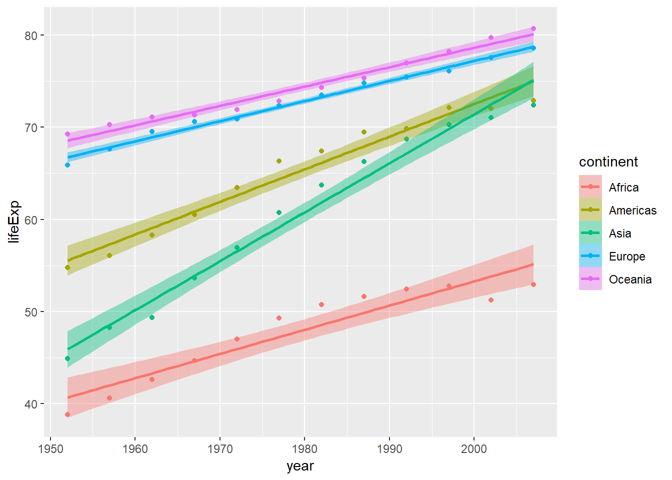
gapminder %>%
    group_by(continent, year) %>%
    summarise(lifeExp=median(lifeExp)) -> gapyear

ggplot(gapyear, aes(x=year, y=lifeExp, color=continent)) +
    geom_point(size=1.5) +
    geom_smooth(aes(fill=continent), method="lm")
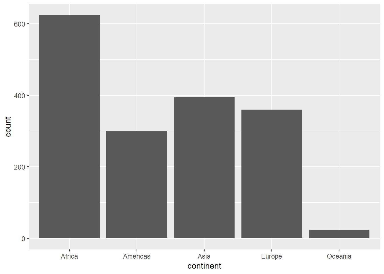
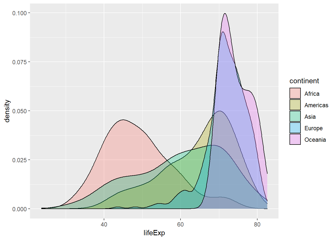
Bar and density
ggplot(gapminder, aes(x=continent)) + geom_bar()
ggplot(data=gapminder, aes(x=lifeExp, fill=continent)) +
    geom_density(alpha=0.3)
ggpubr
#install.packages('ggpubr')
library(ggpubr)
#> Loading required package: ggplot2
#> Loading required package: magrittr
# Create some data format
# :::::::::::::::::::::::::::::::::::::::::::::::::::
set.seed(1234)
wdata = data.frame(
   sex = factor(rep(c("F", "M"), each=200)),
   weight = c(rnorm(200, 55), rnorm(200, 58)))
head(wdata, 4)
##   sex   weight
## 1   F 53.79293
## 2   F 55.27743
## 3   F 56.08444
## 4   F 52.65430
#> sex weight
#> 1 F 53.79293
#> 2 F 55.27743
#> 3 F 56.08444
#> 4 F 52.65430
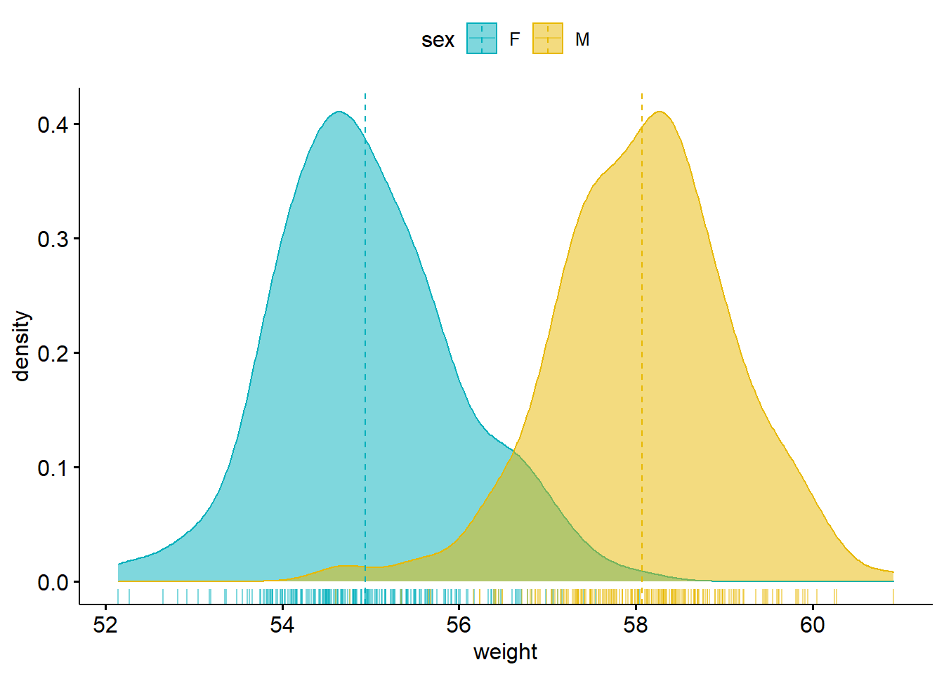
# Density plot with mean lines and marginal rug
# :::::::::::::::::::::::::::::::::::::::::::::::::::
# Change outline and fill colors by groups ("sex")
# Use custom palette
ggdensity(wdata, x = "weight",
add = "mean", rug = TRUE,
color = "sex", fill = "sex",
palette = c("#00AFBB", "#E7B800"))
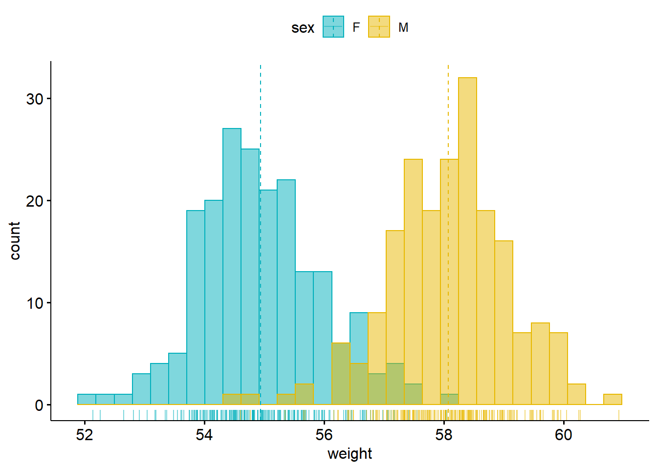
Histogram
# Histogram plot with mean lines and marginal rug
# :::::::::::::::::::::::::::::::::::::::::::::::::::
# Change outline and fill colors by groups ("sex")
# Use custom color palette
gghistogram(wdata, x = "weight",
   add = "mean", rug = TRUE,
   color = "sex", fill = "sex",
   palette = c("#00AFBB", "#E7B800"))
## Warning: Using `bins = 30` by default. Pick better value with the argument
## `bins`.
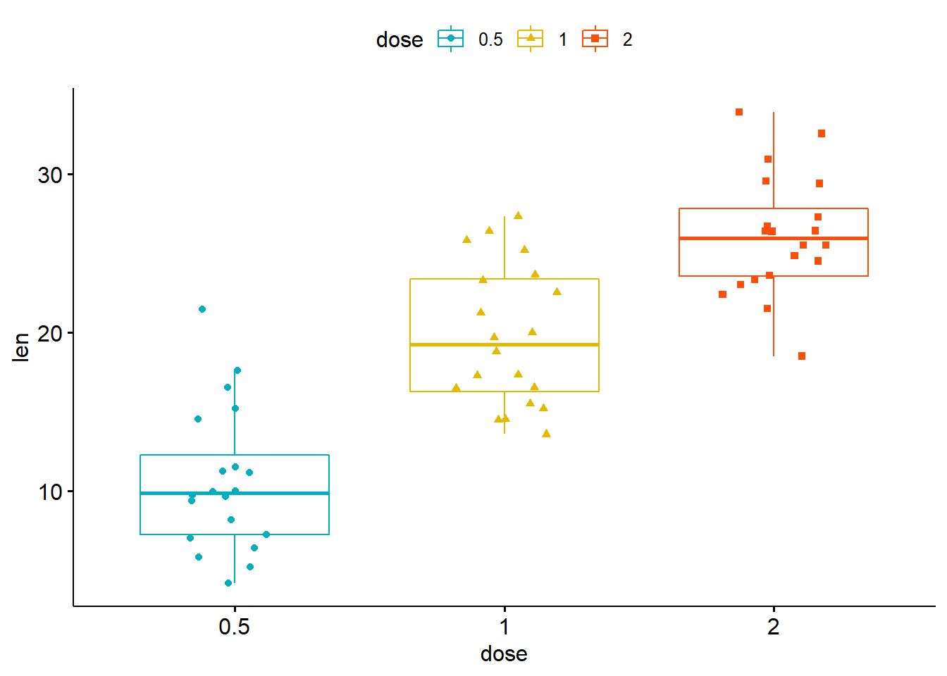
# Load data
data("ToothGrowth")
df <- ToothGrowth
head(df, 4)
##    len supp dose
## 1  4.2   VC  0.5
## 2 11.5   VC  0.5
## 3  7.3   VC  0.5
## 4  5.8   VC  0.5
#>    len supp dose
#> 1  4.2   VC  0.5
#> 2 11.5   VC  0.5
#> 3  7.3   VC  0.5
#> 4  5.8   VC  0.5

# Box plots with jittered points
# :::::::::::::::::::::::::::::::::::::::::::::::::::
# Change outline colors by groups: dose
# Use custom color palette
# Add jitter points and change the shape by groups
ggboxplot(df, x = "dose", y = "len",
                color = "dose", palette =c("#00AFBB", "#E7B800", "#FC4E07"),
                add = "jitter", shape = "dose")
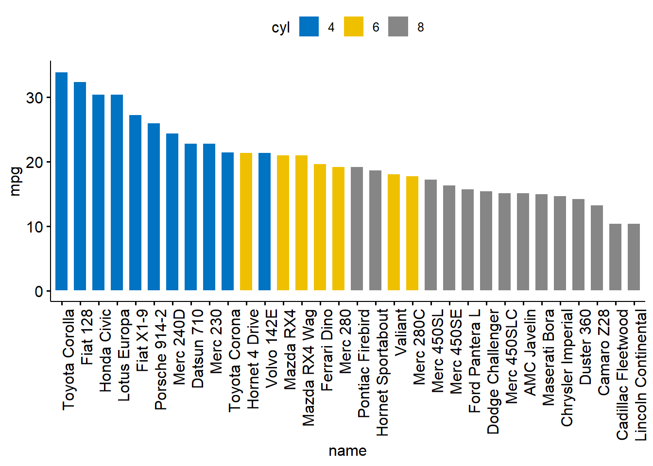
# Load data
data("mtcars")
dfm <- mtcars
# Convert the cyl variable to a factor
dfm$cyl <- as.factor(dfm$cyl)
# Add the name colums
dfm$name <- rownames(dfm)
# Inspect the data
head(dfm[, c("name", "wt", "mpg", "cyl")])
##                                name    wt  mpg cyl
## Mazda RX4                 Mazda RX4 2.620 21.0   6
## Mazda RX4 Wag         Mazda RX4 Wag 2.875 21.0   6
## Datsun 710               Datsun 710 2.320 22.8   4
## Hornet 4 Drive       Hornet 4 Drive 3.215 21.4   6
## Hornet Sportabout Hornet Sportabout 3.440 18.7   8
## Valiant                     Valiant 3.460 18.1   6
#>                                name    wt  mpg cyl
#> Mazda RX4                 Mazda RX4 2.620 21.0   6
#> Mazda RX4 Wag         Mazda RX4 Wag 2.875 21.0   6
#> Datsun 710               Datsun 710 2.320 22.8   4
#> Hornet 4 Drive       Hornet 4 Drive 3.215 21.4   6
#> Hornet Sportabout Hornet Sportabout 3.440 18.7   8
#> Valiant                     Valiant 3.460 18.1   6
ggbarplot(dfm, x = "name", y = "mpg",
          fill = "cyl",               # change fill color by cyl
          color = "white",            # Set bar border colors to white
          palette = "jco",            # jco journal color palett. see ?ggpar
          sort.val = "desc",          # Sort the value in dscending order
          sort.by.groups = FALSE,     # Don't sort inside each group
          x.text.angle = 90           # Rotate vertically x axis texts
          )
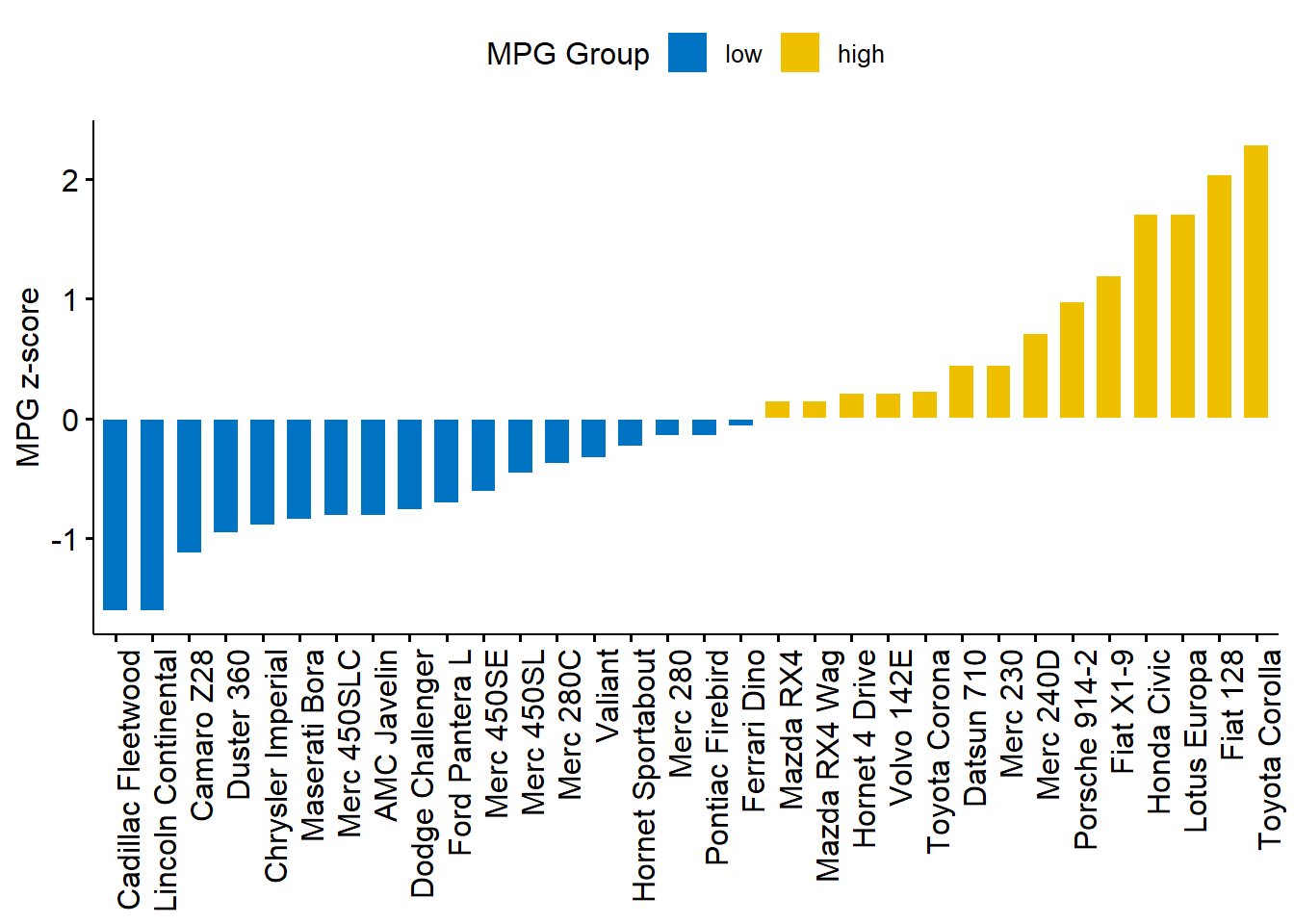
# Calculate the z-score of the mpg data
dfm$mpg_z <- (dfm$mpg -mean(dfm$mpg))/sd(dfm$mpg)
dfm$mpg_grp <- factor(ifelse(dfm$mpg_z < 0, "low", "high"),
                     levels = c("low", "high"))
# Inspect the data
head(dfm[, c("name", "wt", "mpg", "mpg_z", "mpg_grp", "cyl")])
##                                name    wt  mpg      mpg_z mpg_grp cyl
## Mazda RX4                 Mazda RX4 2.620 21.0  0.1508848    high   6
## Mazda RX4 Wag         Mazda RX4 Wag 2.875 21.0  0.1508848    high   6
## Datsun 710               Datsun 710 2.320 22.8  0.4495434    high   4
## Hornet 4 Drive       Hornet 4 Drive 3.215 21.4  0.2172534    high   6
## Hornet Sportabout Hornet Sportabout 3.440 18.7 -0.2307345     low   8
## Valiant                     Valiant 3.460 18.1 -0.3302874     low   6
#>                                name    wt  mpg      mpg_z mpg_grp cyl
#> Mazda RX4                 Mazda RX4 2.620 21.0  0.1508848    high   6
#> Mazda RX4 Wag         Mazda RX4 Wag 2.875 21.0  0.1508848    high   6
#> Datsun 710               Datsun 710 2.320 22.8  0.4495434    high   4
#> Hornet 4 Drive       Hornet 4 Drive 3.215 21.4  0.2172534    high   6
#> Hornet Sportabout Hornet Sportabout 3.440 18.7 -0.2307345     low   8
#> Valiant                     Valiant 3.460 18.1 -0.3302874     low   6
ggbarplot(dfm, x = "name", y = "mpg_z",
          fill = "mpg_grp",           # change fill color by mpg_level
          color = "white",            # Set bar border colors to white
          palette = "jco",            # jco journal color palett. see ?ggpar
          sort.val = "asc",           # Sort the value in ascending order
          sort.by.groups = FALSE,     # Don't sort inside each group
          x.text.angle = 90,          # Rotate vertically x axis texts
          ylab = "MPG z-score",
          xlab = FALSE,
          legend.title = "MPG Group"
          )
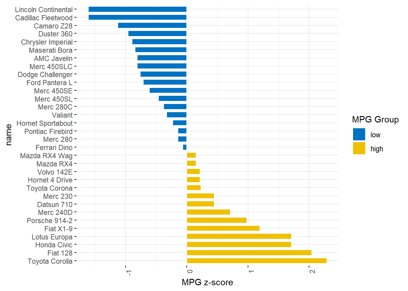
ggbarplot(dfm, x = "name", y = "mpg_z",
          fill = "mpg_grp",           # change fill color by mpg_level
          color = "white",            # Set bar border colors to white
          palette = "jco",            # jco journal color palett. see ?ggpar
          sort.val = "desc",          # Sort the value in descending order
          sort.by.groups = FALSE,     # Don't sort inside each group
          x.text.angle = 90,          # Rotate vertically x axis texts
          ylab = "MPG z-score",
          legend.title = "MPG Group",
          rotate = TRUE,
          ggtheme = theme_minimal()
          )
Ziqian Xia (夏子谦)
Incoming PhD Student
My research interests include Environmental Behaviour、Environmental Economics and Meta Science.